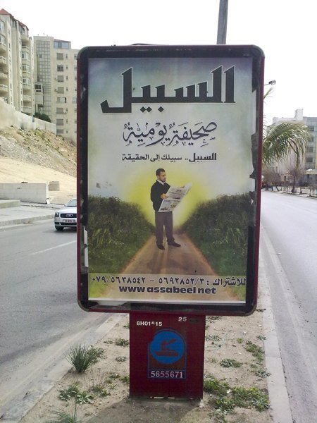
The big media news this week in Jordan is that Al Sabeel (English: The Path), Jordan’s Islamist newspaper has gone into daily publication. I have not had a chance to pick up a copy yet. My mental image of their previous weekly effort (mainly formed from glimpsing the paper on newsstands) is that it was heavy on ideology and super-large headlines on the cover, celebrating the victories of this or that Isalmist resistance movement or party or complaining loudly about local corruption or moral impurity.
I managed to skim through today’s issue as PDF online and formed some initial impressions. But before getting a real look at the product itself, I was faced with Al Sabeel’s advertising campaign that can be seen in various places in Amman.
It looks “weird” but is also “interesting” when analyzed!
It’s a rather surreal photo collage: A bearded young man stands on a dirt road leading towards a strangely yellow sun on a pale blue sky. He’s reading a copy of his favorite newspaper. The rural road is flanked with heaps and heaps of greenery. Not trees, but more like overgrown grass and bushes.
The tagline: “Your Path to The Truth”. Fair enough, I guess. Al Ghad uses “Truth Above All”.
Then there is the over-ornamented product descriptor: “A Daily Newspaper” written in a font that mimics traditional Arabic calligraphy.
On the technical level, it looks like a flashback to the 70’s or 80’s that met Photoshop in the 1990’s.
If I want to analyze this poster, I think it exposes some kind of Islamist “virtual reality”.
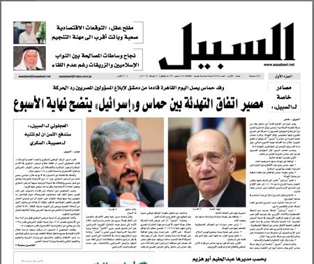
In this virtual reality, you have bearded young men, in conservative (yet western) dress, in the forefront. Women, though “important” and “respected” are not to be seen, if not absolutely necessary. A quick look at today’s issue proves this. In the ENTIRE issue of 28 pages, only ONE face of a female is to be seen! Needless to say there are dozens of men’s faces, including several Israeli politicians and even a bare-chested Juventus football player ![]()
Then, what can we say about the choice of a rural dirt road as the symbolic “path” that leads to the “sun of truth”?
I think that this reflects a yearning to the perceived “simplicity” and “purity” of the village. It’s a wished-for world of traditional values and moral clarity. On a certain level this reveals an uneasiness with contemporary city life with all its contradictions, mixing of the sexes and diverse lifestyles. This reality is hard for many Islamists to swallow. The idealized, virtual village, with abundant “greenery” and “goodness” (not the real village, mind you) is a convenient escape.
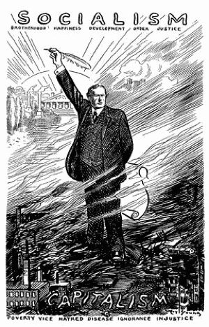
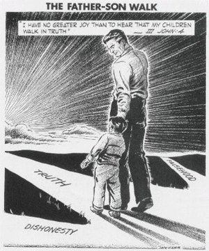
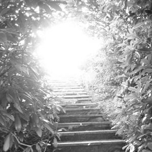
The path leading to the sun as a design motif can be seen in many examples of visual communication: socialist propaganda, Christian and Buddhist religious promises of enlightenment and truth and commercially-driven promises of a better tomorrow..

What Al Sabeel has done with the calligraphic element of its poster is also revealing. The art of calligraphy, which is a cornerstone of Islamic art, is one of the favorite art forms of Islamist-inclined people. The over-ornamented, traditional looking calligraphy on Al Sabeel’s poster is, as mentioned above, merely a computer font. So, although this calligraphy element on the poster is supposed to reflect a celebration of Arabic-Islamic tradition and grandeur, further examination reveals it as a cosmetic and “mass produced” reproduction of the past, with no effort of real craftsmanship.
I would dare to say that dealing with tradition and history in this “non-ncritical” and “un-crafted” manner is one of the major problems of Islamist culture (and the wider Arab culture) as a whole.
Finally, the overall lack of design quality of the poster is another indication of kind the culture this paper is coming from. Compare this effort to the promotional posters of Al-Ghad for example, which use clever slogan and professional photography to get the message across. And don’t tell me Al Sabeel doesn’t have money or human resources to do a decently designed and produced ad.
Ironically, this low quality, cliche-laden visual style might actually appeal to a large segment of society, which finds comforts in cliches and simplistic messages.
Read these related posts on 360east:
- Faces For Lebanon: Kickstarting a global campaign of human solidarity
- “Jordanians always smile” and other “impossibilities”!
- The controversial billboards that vanished!
- Isn’t it time for new types of political forces in Jordan to emerge?
- A ’special’ mobile plan for parliament election candidates only!
Comments
13 responses to “Al Sabeel’s ad campaign: Islamist virtual reality?”
Judging from your analysis of the news paper, the newspaper will not succeed, people are growing more and more tired of this religious perspective on life.
I might buy myself a copy just to have a closer look on what the authors have to offer, but I highly doubt that I will find anything new or interesting. I think it will just be full of descriptions of western conspiracies and Zionist agendas that want to do destroy the Muslim cultures and traditions.
“Ironically, this low quality, cliche-laden visual style might actually appeal to a large segment of society, which finds comforts in cliches and simplistic messages.”
Sadly very true!
I enjoyed reading your analysis! Great post.
Loved the analysis.
“Ironically, this low quality, cliche-laden visual style might actually appeal to a large segment of society, which finds comforts in cliches and simplistic messages”
I couldn’t agree more. That ad would be the most appealing to the potential readers of the newspaper. I used to read the weekly publication and it was stuffed with ideology and very scarce in news. I hope their daily publication will be the exact opposite
Ah a sad state of affairs! Women no where to be seen, uneasiness with modernity and urban life, inability to accept different truth and then to top it off no sense of aesthetics! Great analysis
hi Ahmad,
I’m writing to say thank you for your beautifully redesigned Amman centennial logo, I would have never guessed that you were the pioneer of the new insignia had it not been for this post above and for your repeated discussion about branding and the importance of it. Very reflective with good taste indeed.
Salam Ahmad,
Let me give an alternative analysis:
This poster was not designed by a real graphic designer, but rather an engineer-with-photoshop who just “came up” with it, and it went to printing press with very little design review.
I think this reflects the “pragmatic” side of the new islamic movement in jordan. Aside from the “professional politicians” (whom I hate by the way), most of the members are really just simple hardworking Jordanians who want to do things the “right way”.
They are against corruption & wasta nepotism.
They are for efficient and successful management.
Unfortunately, they extend this black-and-white pragmatism to non-engineering fields (that most of them studied very little), like religion, politics, and social relations.
“The World in inherited by the stubborn”
Just to add one more to the list of the motifs relating to the path leading to the sun:
http://tinyurl.com/ddqy6p
At least they succeed reflecting their own ideology or thoughts on this ad.. for me, that was successful step. For them, i think, it’s not important to have a cutting edge visuals, or a shocking concepts that makes you think twice before you say: Wow!, or a high level of great photoshop work that competes with the other local papers..
No, they just announced their ideas in a straight and consistent way, satisfying themselves, and their loyal readers too.. that’s it! they don’t care about any other aspects.
What’s wrong with that?
I meant by “They” :Al Sabeel people.. It’s not correct to generalize every Jordanian muslim in under their group.
I hope that the next generation of muslims in Jordan tries to have a much clearer and consistent language to express themselves to their community, and to the world.
And to hire a better designers
I Liked the example of Islamist newspapers in Turkey.. Zaman was a good one:
In Turkish:
http://www.zaman.com.tr/anasayfa.do
PDF version:
http://www.zaman.com.tr/ezaman.do
In English:
http://www.todayszaman.com/tz-web/
ˆˆ
Arrabi I like your analysis. Yes there is a degree of “pragmatism”. But all of this reflects a world view that a. is pretty morbid and b. lack a sense of quality. In the end its the same story all over again. Too much reliance of faith and too little care about quality and doing thing right.
Hussein. I am not talking about muslims but specifically “Islamists” ie the stream of “political Islam”.
I am NOT looking for “shocking concepts” or “cutting edge visuals”. I just expect a minimum amount of quality when dealing with the visual medium.
I also criticize the “world view” represented in this poster, not because it is straightforward” or “simple”, but because I think represents a step backward not forward.
Wa shukran ..
Nice one Phil, but I think there is a bit of a difference. I might be splitting hairs here but the path in the obama logo goes sideways and not singularly towards the sun. It look more like a fertile land than the “straight path”.
And there is no “man leading the way”..
But yes, there is a similarity..
Humeid, i read this and i’m thinking to myself that you probably had a very specific person in mind when writing this, this person is your typical work colleague “islamist”… otherwise i would’ve concluded that you have read too much into a rather typical arabic ad…
I do however object the comfortable generalizations made in the body of the post and then followed by most of the
mostlyrespected commentators here, the usual suspects never fail to prove my humble self to be right about their uncanny intentions preying on any post on the blogsphere critical about any aspects of Islam and Moslems…I do entertain the fact that you made a clear distinction between what you perceive as “islamist” and others, you know my view on the whole genera of islam branding, that is to say Islam is not a franchise, and if it was to be so, then one must strike a franchising agreement and get endorsement from God almighty to use it for worldly benefits.
Be it a political party, a newspaper, a hospital, a singer or a general themed product (they produced an “islamic” car already)!
p.s: to the curious unknowing reader, it’s not possible to neither get endorsed or become a franchisee of Islam from God, it would be nice idea to sell upon, but its just not possible!
Humeid,
I hate to rain on your parade, but I think you are reading too much into this logo. The short of it, its a logo “designed/inspired” without much thought or analysis.
I bit it was more like this:
Two or three chaps in a room fiddling with photoshop.
Chap one says: how about we show a man/brother (of course a bearded one) reading a newspaper on a road in the middle of greenery (since we don’t have much of that in Jordan)?
Other chaps in the room: you are one hick of a designer brother Abu-Romaneh. What don’t you add a sun at the far end of the road just to show that we inspire for clearness and all that.
The chief editor glances at it and says: thank you brothers, well done. Nobody else gives it a second thought.
Wa shoukran