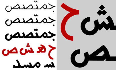
A decade ago (around 1995) I was experimenting with an Arabic uniform stroke typeface. I was trying to escape from the geometric rigidity usually associated with ‘modern’ Arabic type and instead use a more dynamic geometry (that’s closer in spirit to the traditional Arabic Naskh script) to create the letter forms.
I never had the time to work on this typeface again. I dug up the image below recently after I saw Yassar Abbar’s work in Eye magazine (see next post about that). Abbar’s work represents an advanced stage of development of the idea of creating what I would term ‘a humanist Arabic sans serif typeface’.
Comments
2 responses to “A type experiment that went nowhere!”
That’s so nice, I like the typeface. Where do you think we can download your font? Because I want tot use it. Also, I am thinking abour taking courses in arabic calligraphy and I am going to work on creating a new arabic font this summer during my vacation. I am a tunisian teen living in New York. I will be checking your blog from time to time
Ever heard of http://www.arabictypography.com ?