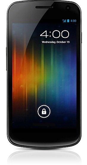
That lock screen looks promising, doesn’t it. That’s how Google’s newest version of Android looks. It is a major release of Android, and one of its major features was to supposedly make its design “lovable”. As Android’s design chief Matias Duarte himself said: people sort of respected Android, but no one loved it. Its latest release, called Ice Cream Sandwich (ICE) was supposed to change that.
There is a an interesting discussion going on in the mobile world these days. It is a discussion of design and style. Apple’s iOS changed the industry with the highly attractive and friendly iPhone user interface. Now that other operating systems are catching up with iOS, the word “design” is becoming central to the discussion.
Apple’s competitors are trying to describe iOS’s design as gimmicky and “fake”. You now: Apple uses leather, paper and wood textures here and there. It incorporates highly stylized icons. You even see a torn note paper on the iPad’s note taking app.
Then you have Microsoft and its relatively new Windows Phone. Even if you are a Microsoft hater you have to admit that they did an amazing job with Windows Phone 7. What they are adopting is what they call an “authentic digital” design style. No realistic looking icons. No leather. No torn paper. Just pure, modern typography and lots of empty space. It really appeals to the modern designer in me.
But Android’s design people claim they don’t want to be neither this nor that. They make fun of Apple’s cute icons and they claim that WIndow’s approach is too starkly modern.
Matias Durate went as far as saying “I give you the web” when he revealed Android’s ICE to the editor of a major tech blog. What he meant by that is: I give you the diversity of the web. It’s all about the diversity of content.
Interesting. Ha?
Google even designed a special modern font for ICE: called Roboto.
I was eagerly awaiting ICE’s update on my Nexus S precisely because I wanted to really experience that new, improved Android design philosophy.
But I have to say I was pretty disappointed.
The first signs of trouble appeared when I watched a promotional video about ICE. That video clearly shows that someone at Google/Android is totally in love with Tron! (droid on light bikes!). And lo and behold, ICE’s interface is full of Tron-ish references, complete with that electric blue/wireframe/glassy appearance.
To me, attacking iOS as gimmicky because of all the wood and leather, then adopting Sci-Fi gimmicks in your own phone interface seems a bit ridiculous.
To be fair, I feel that ICE is somewhat better designed. There is also a novelly factor in all this Tron-like stuff and it is obvious that some sort of design revolution has gone on in AndroindLand. My goodness, they even changed the key color from green to blue. Icons where changed. A lot was thrown out and new stuff was brought in.
But a revolution doesn’t always mean an improvement.
I think the icon situation in ICE is a total design mess. Android really looks a lot like Windows (for desktop computers). Too colorful. Too many shapes. Too many styles. Including a number of icons that adopt an illustrative 3D style (like the new Camera icon, see below).
One of the most annoying looking icons is the new “People” icon, with its simplistic round face. It makes an appearance all over ICE’s interface.
Even the shortcut bar at the bottom of the screen (which by default contains the phone, people, messaging and browser icons, as well as the apps icon in the middle) is a mess. I can count three design approaches there if I want to be kind.
This reveals a deeper issue at Google. Google has always been the no-design company. It’s interface where designed by techies/engineers. I even heard that they did not employ designers unless they knew how to write code!
Now, as the company operates in a web and a mobile world where design and branding plays an ever increasing role, Google is trying to catch up.
Their recent Google iPad app looks very promising, design-wise. The Google icons used in that app show off the new “matt” and subtly stylized icon design approach first used on the Chrome icon. There is a nice consistency across different icons.
But at the same time, I can now count 3 different icon design for Gmail alone across different Google properties.
Same goes for their News icon. And so on.
I’ve been living with ICE for a week now. I don’t think Android has become much easier to use. Yes, there is more attention to visual design, but I am not a big fan of the Tron look. And I just feel the whole thing is still inconsistent visually and even functionally. I feel that every time I go back to my iPad. And I felt it when I was carrying a Nokia N9 which runs Nokia’s (now-pretty-much-doomed) MeeGo. Now here is an OS that could tech both Apple and Google some design and user interface lessons.
I leave you with some screen shots and comments..
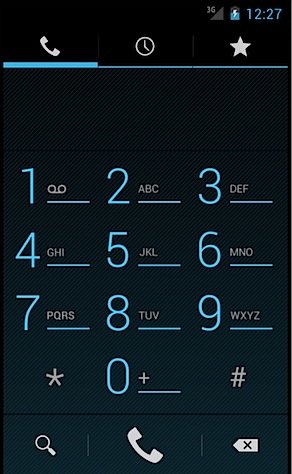
ICE’s dial pad. Looks quite neat. But the novelty wears off fast.
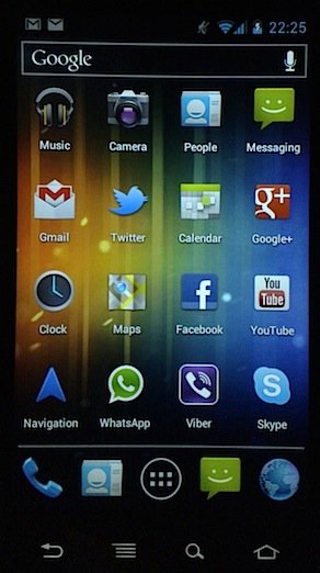
Android doesn’t have a specific icon shape. So you end up have all kind of shapes, styles and colors. To me, it looks messy.
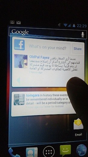
See the glassy 3D Tron effect when you try to “pull” at the last home screen. You get a tilting animation, which looks kind of cool, but ultimately is very useless.
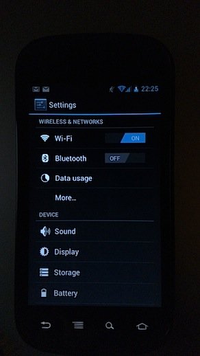
In the setting screen we suddenly get this 2D look and angular buttons
![]()
Just look at those Music and Camera icons. Then compare to the slightly stylized People icon with the simplistic face and then the other face on the almost flat Messaging icon.

Doesn’t this icon mix look like something straight out of the 1990’s?
![]()
This is the Gmail icon in Android..

And the Gmail ice on the Google iPad app.
![]()
Why can’t Android look like this? The icons on the Google iPad app.
![]()
Even more icons on Google’s web offering.
![]()
And yet another design language on Google+
And now look at the elegance of MeeGo Harmattan!
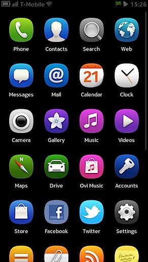
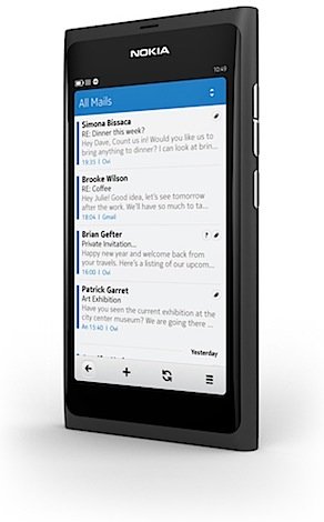
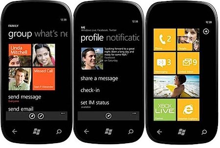
And for reference.. Windows Phone 7’s “digital modernity”..
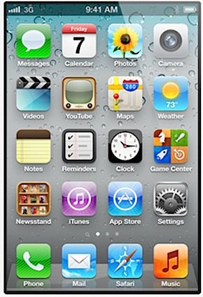
And Apple’s iOS.. You can call it to cute. But it works damn well and people seem to love it.
If you read this far you are a true design geek. Congratulations!
Comments
7 responses to “Google’s design mess: Android’s Ice Cream Sandwich adds to the problem”
I dont care if the N9 is doomed or not, am getting one, I want the white glossy one, it is fantastic:-)
good point about Google being the no design company.
One simple solution: Google needs to find it’s Jony Ive.
Thanks for this very insightful article. I feel exactly the same way. Android is lacking consistency. Windows Phone 7 is not getting the praise and attention it should. Apple is overdoing it with skeuomorphism, but people love it …
It will be interestig to see what the next years will or won’t bring.
Great post, Ahmad. And I already feared the android virus had taken over.
Personally I became a big fan of WP7 and choose it over iOS. I really do like that clean look that is just appropriate in my view for the small screen of a mobile phone and puts your content first instead of trying to flirt with you through the icons, gradients and pseudo-authentic textures..
Hope WP7 consumer base is growing …
An interesting read and very well put together. The biggest problem I have with Android is the name – it is not a very imaginative title however good it may be!
This is pretty much my experience, no matter how much I toy around with my Android phone I am left with a feeling of it being cluttered and in a graphical disarray. There is no coherent design language, no standards, widgets goes one way, icons go another, unification is nowhere to be found, logic and reason are not met anywhere.
Considering the challenge of the market today, what with the iOS unified and properly documented design guidelines and how it has taken the world by storm…
I really do not like feeling that somethings I use so frequently and depend on so heavily are as cluttered as my Android Samsung Galaxy S2 Pro phone feels it is. It is a true nuisance, and one that grates at me every time I look at the UI. Not a very comforting feeling to be had I can tell you.
In a lot of ways, I miss my old iPhone.
I myself don’t like most Google designs and mostly hate G+ design.
But it seems practicality still sells as much as elegance.