
It all a bit crazy. Cingular, the leading US mobile operator, has gone through a number of mergers recently. Now the result seems that Bellsouth, SBC and Cingular will now operate under the the ‘new’ AT&T brand and logo.
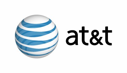
Speaking about the new logo, pictured above, I was shocked when I saw it today. It’s not like I like to cling on to classic logos too much, but this one was a bit hard to swallow (according to a rectn New York Times story it was designed by Interbrand). They’ve given it the fashionable 3D look while retaining the blue stripes of the original. American design master, the late Paul Rand, designed the ‘old’ logo, which can be considered one of the most imitated logos worldwide. He also designed the IBM logo and the (now replaced) UPS logo. Rand fands must be in tears. One by one the old master’s logos are being replaced. CORRECTION: this seems to be a widespread misconception. It was, in fact late American design master Saul Bass who designed the old AT&T logo(s). See comment from David below.
The new AT&T logo will also do away with the bold capital letters and repace them by lowercase letter written in a light, trendy sans serif.
The Cingular logo, if reaplced, is also a big loss. It was a landmark logo in the telecom business when launched five years ago in 2000. So much money and effort were spent to cement its position, especially after Cingular bought AT&T wireless. Now all of this will be rolled back!
This must be totally confusing for customers. My feeling, although I have not read enough about the rationale, is that some ‘corporate ego’ is at work here, which is driving the will to unify the Cingular, SBC and Bellsouth brands under the ‘great’ name of AT&T. The whole thing is not sitting well with me.
Here’s another take on the new AT&T logo.
Here is a suggestion to roll back the logo even further in history.. ![]()
![]()
(Found on Jesse Kovach’s Website
Comments
5 responses to “Branding craziness: Cingular will use the AT&T name..”
I like the logo…but not the lowercase abbr. And does this mean their service will be improved?
cool… i miss the AT&T days when i was working them before the spinn of of the gynat in 1996 ..
Big Mama bell
I don’t mind all the talk about the bells, whistles, and gizmoz, provided that when everything is said and done the cost of making global long distance calls gets set an affordable price.
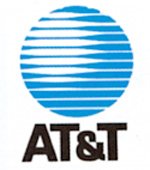
The original AT&T logo was actually designed by another american graphic design genius, Saul Bass, who had also designed the previous, beautiful Bell symbol. He was slightly criticised for his affection for blue, circular logos with white stripes (Bass also did Minolta and the old Continental airlines logo).
I enjoy your blog.
lower case is trendy.
i support the bauhaus school…